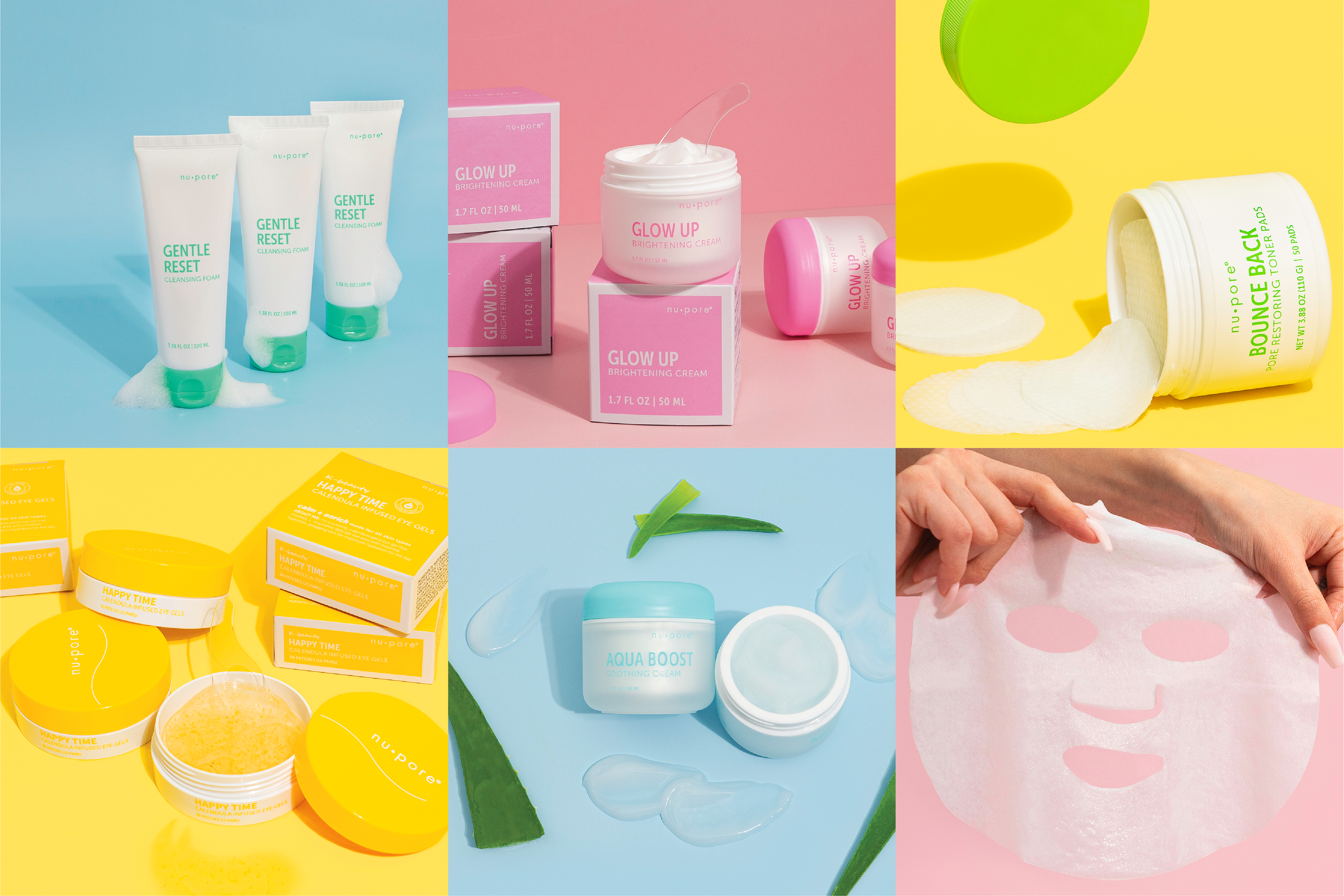
K-beauty has been all the rage in the US skincare market for more than a decade with no signs of boredom from consumers. When Nu•pore launched with the mission to make K-beauty accessible to everyone, they prioritized balancing quality with affordability. I got to know Nu•pore as a packaging designer and eventually worked with them as an art director in a brand refresh.


The overhaul of Nu•pore products and packaging focused on appealing to the core demographic; young, modern skin care consumers on a budget. A simple, clean aesthetic combined with bright colors provides a light, airy feel that is approachable. Descriptions and simple icons highlight product features to easily communicate with the customer. Some legacy products were cut and a line expansion was developed to offer products that better position Nu•pore to compete with newer k-beauty brands.

As new packaging and products roll out, branded product and educational content is distributed to sales teams, retail accounts, and influencers. Online marketplaces are updated and social media posts are scheduled with new content to showcase Nu•pore’s continued product advancements and educate new customers about the brand.


